In 2023, we launched a range of six new "Conscious" colours—a palette inspired by the serene landscapes to which we retreat to. These muted tones include Morning Mist, Cloud, Nood, Mushroom, Olive and Rowboat. The perfect additions for softer and more organic palettes.
Our team put together this guide to assist you when it comes to selecting your basin (or bath) colour.
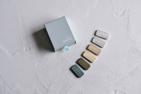
Best Practice when Selecting a Colour
The best way to select your basin colour is through our Sample Kits. Images are for reference only and often aren't the best reference when selecting a colour due to photo editing, lighting and more.
When you receive your sample set, we recommend taking your top colour choices and pairing them next to other selections for the space (such as tapware colour, vanity finish, benchtop, tiles, paint colours etc.). This will give you an indication of what the "true" colour will look like and whether it compliments the space. Another tip is to take the sample chip and look at it in the room itself, as lighting may influence your final colour selection.
We included some comparisons to colours in similar families below, as well as tapware colour suggestions. The below are suggestions only, your Architect and Designer is the best point of call when it comes to finalising your Nood Co basin colour!
Morning Mist
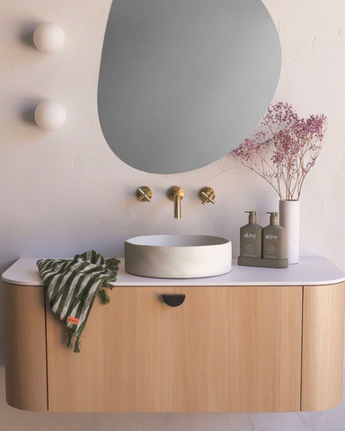
The perfect warm neutral. Morning Mist is a luminous off-white with a slight blush undertone. This gives it a warmth that compliments natural materials like timber and stone, whilst still allowing the basin to be a standalone piece.
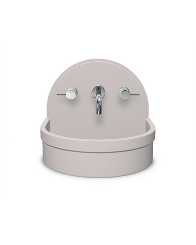
Morning Mist is complemented beautifully with greens, pinks and blues. It’s the warmest tone when compared to our Ivory and Cloud colours. If you’re looking for less contrast in your design and for more of a soft palette, Morning Mist is the way to go.
Tapware Pairings: Brushed Nickel, White, Gold, Rose Gold and Brass

Cloud

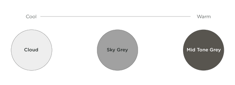
Cloud is a neutral cool grey tone which is the lightest of our grey colour family. It’s lovely for more contemporary designs and compliments cooler colour palettes, as well as true whites beautifully. Cloud throws a slight tinge of blue in certain lights.
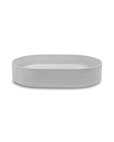
When compared to our other greys, Cloud is the coolest tone of the three. Sky Grey sits in between as a neutral grey, whilst Mid Tone Grey is a deep warm grey.
Tapware Pairings: Chrome, Black, White and Gunmetal
Nood

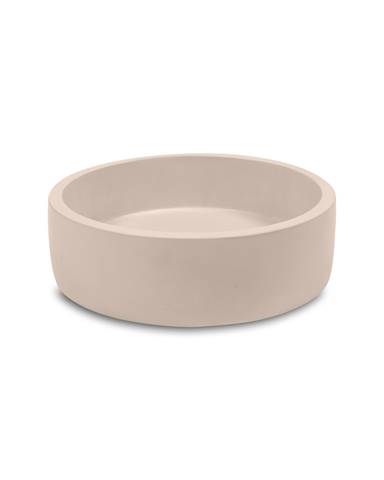
Nood is a subtle shade of earthy peach. Designers and Architects have been using ‘Nood’ in moodier spaces as well as more Mediterranean designs, both of which it compliments beautifully.
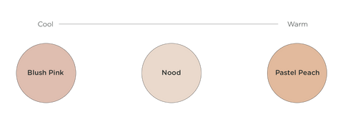
When compared to our Blush Pink and Pastel Peach, Nood sits in between and is the lightest of the three. Though it does complement nicely with pink, yellow and orange hues.
Tapware Pairings: Brushed Nickel, White, Gold and Brass
Mushroom
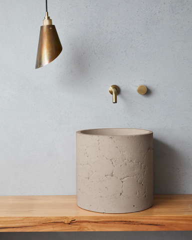
Mushroom is unlike any other Nood Co colour, it’s a neutral to warm brown that feels like at home with a warmer and moodier palette.

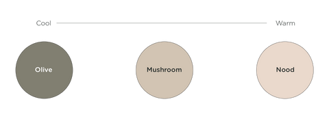
It sits in between Olive and Nood when it comes to warmth. Mushroom is unique in that it can compliment both rich and deep palettes, as well monochrome ones.
Tapware Pairings: Gold, Rose Gold and Brass
Olive
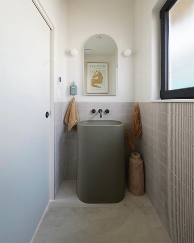
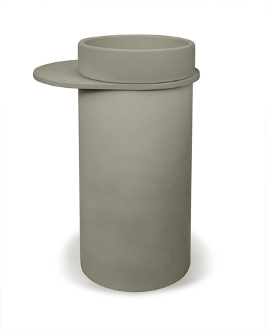
Our newest addition to our range of greens, Olive is a lot warmer than our existing Teal and Mint colours. Olive throws more brown and yellow tones, and suits earthy and organic palettes. Olive looks particularly nice when paired with gold and brass.
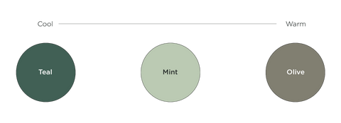
Olive is the warmest out of our three greens, with Mint sitting in the middle (though leaning more towards cool tones) and Teal being the coolest tone of the three.
Tapware Pairings: Brushed Nickel, White, Gold and Brass
Rowboat
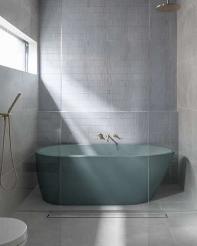
Rowboat is our latest blue addition which is warmer and throws more grey and green tones than our Powder Blue and Copan Blue. Rowboat sits right in the middle of our blue and green colour families.
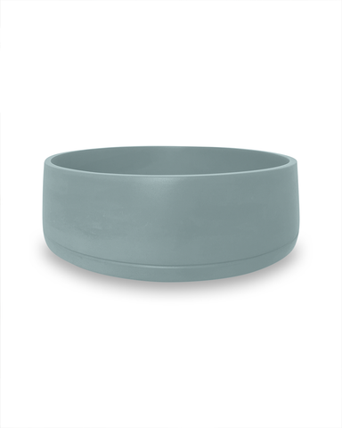
Even though it is warmer than our existing blues, the colour itself is pretty neutral and pairs nicely with most tapware colours.
Tapware Pairings: Chrome, Brushed Nickel, White, Gunmetal, Gold and Brass


February 23, 2024
Nood Co