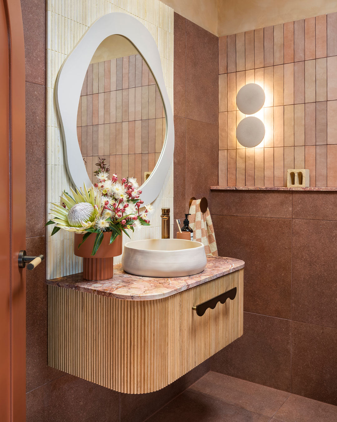
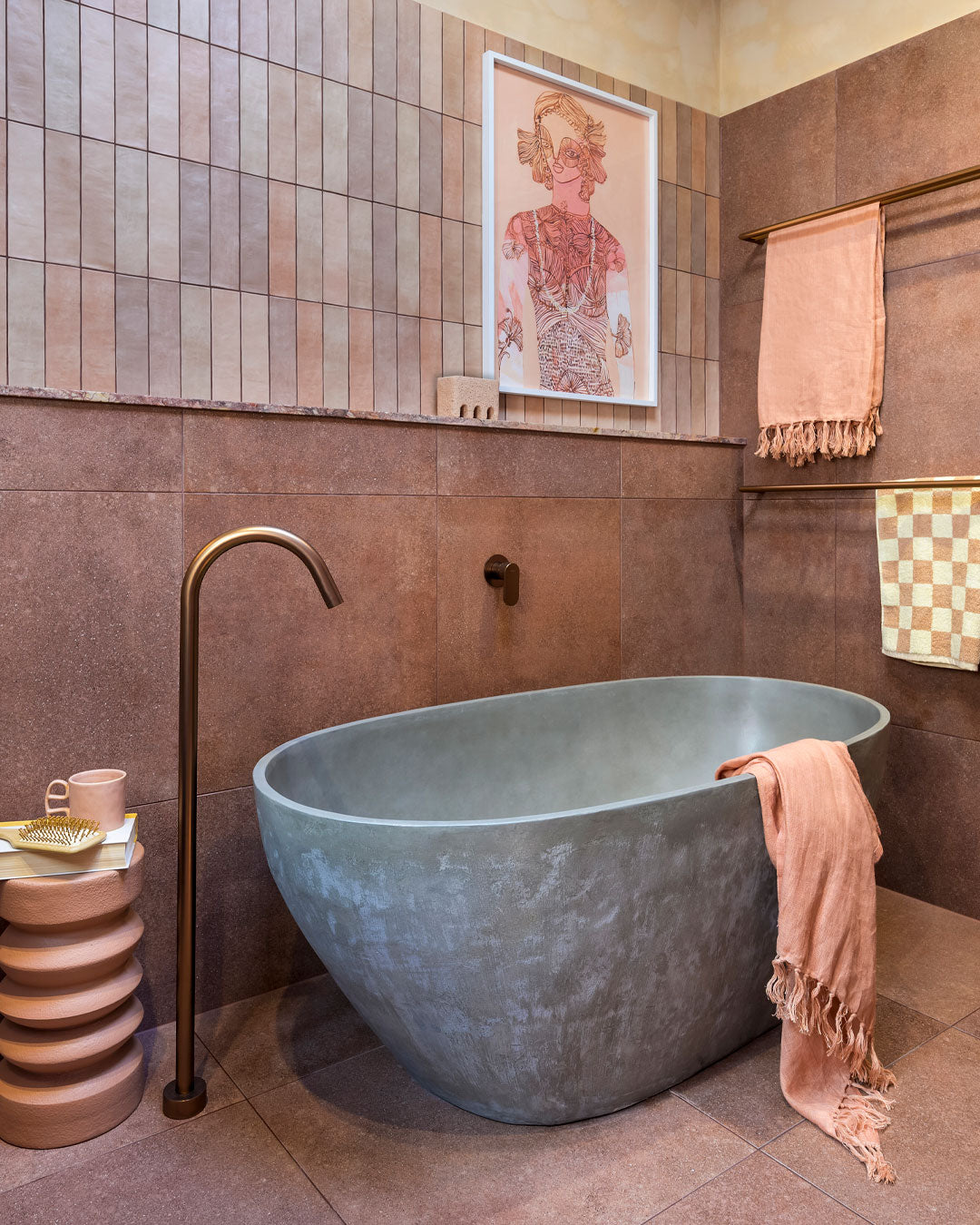
Once a forgotten warehouse, Hipwell Haus has been masterfully transformed into a vibrant home bursting with colour, texture, warmth, and pattern. Steeped in history, the building has found new life under the expert guidance of interior stylist Tim Neve.


Tim's journey with Hipwell Haus began in March this year, after years of searching for the perfect property to realise his dream. He envisioned a space that would not only house his design business but also serve as a retail front and a home for himself and his son. Despite the challenges and setbacks along the way, Tim's vision remained clear.


"This dream has been in the works for years," Tim shares. "I’ve always found with properties that if it’s meant to be, then it’s meant to be. As a designer, you can walk into a space and easily reimagine it. Now that I have this, I feel as though it was waiting for me."


The building’s history intrigued Tim, particularly the name 'Hipwell' emblazoned on the facade. His research revealed that the property had once been a general store at the heart of Mayfield, later serving as a tailor's shop, a barber's, and even an upholstery business. Each layer of its history added depth to Tim's connection with the space, making his restoration efforts all the more meaningful.


Tim's approach to design is deeply personal and intuitive. "I like to stop and listen to the building," he explains. "Each house is different, has a different visual story to tell, and requires different choices." For Hipwell Haus, this meant retaining the open-plan layout downstairs, preserving the exposed brick, and carefully selecting materials that would honour the building's past while bringing in modern elements.


Among the many thoughtful design choices, Tim has incorporated several Nood Co basins into the renovation. The Betty basin in Clay, along with Mill basins in Mushroom and Clay, were chosen to add personality and complement the home's unique character. These pieces play a crucial role in returning the space to its colourful, gritty, artistic lifeforce, creating a perfect blend of old and new.


Upstairs, Tim faced the challenge of transforming the vast, open space into a functional living area. His solution? A luxurious primary suite that takes full advantage of the building’s original features, including the exposed brick and large windows. The suite, with its feature island bedhead, double shower, and walk-in robe, promises to be a haven of comfort and style.


As the renovation progresses, Hipwell Haus is shaping up to be a stunning example of juxtaposition in design—melding the old with the new, and embracing a bold, textured aesthetic that is unmistakably Tim Neve. "Texture will play an important part in the design," Tim notes. "When you’re putting it against the texture of the brick, you need that visual contrast to strike a balance with the choice of materials."


Modern design elements, such as square set ceilings and black aluminium sash windows, will be integrated throughout the space, yet with a nod to the building's heritage. The grid design on the original shop front windows downstairs will be echoed in the new windows, ensuring a harmonious blend of old and new.


Hipwell Haus is more than just a renovation; it’s a celebration of history, design, and the art of storytelling. Through Tim’s vision, this once unloved warehouse is being brought back to life, becoming a home that is as full of character as it is of history.


August 15, 2024
Nood Co


